2021. 8. 10. 22:43ㆍ개발/Next.js
이번 주제에서 알아볼 주제는 아래 다섯 가지로 나뉜다. (주로 정적 데이터를 활용하는 방법에 대해서 다룬다.)
- How to add static files (images, etc) to Next.js.
- How to customize what goes inside the <head> for each page.
- How to create a reusable React component which is styled using CSS Modules.
- How to add global CSS in pages/_app.js.
- Some useful tips for styling in Next.js.
Assets
- Next.js 에서는 'pages' 폴더처럼 최상위 경로에 'public' 디렉토리를 생성하면 root에서 참조할 수 있게 된다.
- 이렇게 생성된 디렉토리는 'robots.txt' 에도 아주 유용하다.
실습
1. download image 파일 (*. jpg) ekdns
2. 'public' 디렉토리에 'images' 디렉터리를 생성
3. 'public/images' 디렉토리에 이미지 파일 저장
4. 이미지 사이즈는 400px x 400px 정도로
5. public 디렉토리 하위에 안 쓰이고 있는 SVG logo 파일은 지워도 됨.
참고 Unoptimized Image (최적화 되지 않은 이미지)
일반적인 HTML에서 image를 띄우기 위해서는 아래와 같이 표기할 수 있다.
<img src="/images/profile.jpg" alt="Your Name" />하지만, 우리는 아래와 같은 항목에 대해 고려해야 한다.
- screen size가 다를때 이미지 출력
- third-party tool 또는 라이브러리를 위한 이미지 최적화
- viewport로 들어갈때만 이미지 로딩
등등
Next.js 에서는 'Image' Component를 통해 쉬운 해결책을 제공한다.
'next/image'는 확장된 HTML img 엘리먼트를 제공한다. Next.js는 이미지 최적화를 default로 제공하며, 브라우저가 지원한다면 resizing, optimizing 그리고 serving images도 제공한다.
이미지 최적화는 build time에 제공하지 않고, 사용자 요구 시점에 맞추어 최적화를 시키게 된다.
static site generators, static-only solutions 과는 달리 빌드 타임은 증가하지 않는다. (이미지파일 10장이나 100백만이나 같다.)
이미지는 default로 lazy loading된다. 이 말은 페이지 속도 저하가 없으며, 뷰포트로 스크롤 될 때 이미지가 로드됨을 의미한다.
간단하게는 아래와 같이 작성할 수 있다.
import Image from 'next/image'

const YourComponent = () => (
  <Image
    src="/images/profile.jpg" // Route of the image file
    height={144} // Desired size with correct aspect ratio
    width={144} // Desired size with correct aspect ratio
    alt="Your Name"
  />
)
Metadata
title 같은 HTML 태그는 head의 한 부분을 담당한다.
Next.js 에서는 <head> 대신 <Head> 를 사용한다. (맨 앞글자가 대문자다.)
<Head>는 Next.js에 빌트인 되어있는 React Component이며, <head> 태그를 수정할 수 있도록 도와준다. (사용시 'next/head' 을 import 해야한다.)
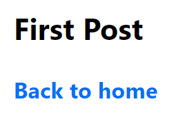
이제 'first-post.js'로 돌아가서 Head를 추가해본다.
import Head from 'next/head'

export default function FirstPost() {
  return (
    <>
      <Head>
        <title>First Post</title>
      </Head>
      <h1>First Post</h1>
      <h2>
        <Link href="/">
          <a>Back to home</a>
        </Link>
      </h2>
    </>
  )
}
위와 같이 입력하여 서버를 돌리고, localhost:3000/posts/first-post 로 접속해보면 title이 "First Post"로 바뀐것을 확인 할 수 있다.
CSS Styling
styled-jsx 라이브러리를 통해 React component를 만들 수 있다.
이외에도 styled-components , emotion 라이브러리를 사용할 수 있다.
Layout Component
먼저, 최상위 디렉터리에 'components' 라는 이름의 폴더를 생성한다.
그리고 이 안에 'layout.js' 파일을 만들고 아래와 같이 입력한다.
export default function Layout({ children }) {
  return <div>{children}</div>
}
그리고, pages/posts/first-post.js 로 돌아가서 아래와 같이 Layout Component를 추가해준다.
import Head from 'next/head'
import Link from 'next/link'
import Layout from '../../components/layout'

export default function FirstPost() {
  return (
    <Layout>
      <Head>
        <title>First Post</title>
      </Head>
      <h1>First Post</h1>
      <h2>
        <Link href="/">
          <a>Back to home</a>
        </Link>
      </h2>
    </Layout>
  )
}
Adding CSS
Layout Component에 CSS 모듈을 입혀보기 위해 components/layout.module.css 파일을 아래와 같이 생성한다.
.container {
  max-width: 36rem;
  padding: 0 1rem;
  margin: 3rem auto 6rem;
}
주의 : CSS Module은 항상 파일명이 '.module.css' 로 끝나야 한다.
위와 같이 만들어진 container style을 사용하기 위해서는 아래와 같이 설정해주어야 한다.
- import css 파일
- styles.container 를 className 으로 사용
위와 같이 생성하게 되면 아래와같은 코드가 만들어지게 된다. (components/layout.js)
import styles from './layout.module.css'

export default function Layout({ children }) {
  return <div className={styles.container}>{children}</div>
}
그리고 localhost:3000/posts/first-post 에 들어가서 확인을 해보면 css 가 적용된것을 볼 수 있다.
또한, F12 (개발자 도구) 를 통해 div class가 unique한 이름을 가진다는 것을 볼 수 있다.
이것은 CSS Module이 자동으로 unique class name을 생성하여 name collisions을 막아준것을 볼 수 있다.
Global Styles
위에서 만든 CSS Modules은 component-level 스타일에 유용하다. 하지만 모든 페이지에 적용 시키고 싶을때는 매 페이지마다 import 해줄수없으니 global style을 정의할 수 있도록 지원한다.
global CSS 파일을 만들기위해서는 'pages/_app.js' 를 만들고 아래와 같이 입력한다.
export default function App({ Component, pageProps }) {
  return <Component {...pageProps} />
}
이렇게 만들면, top-level 컴포넌트로 되어 다른 페이지에서도 호출해서 사용할 수 있게된다.
중요 : pages/_app.js 를 만들고 나면, 꼭 서버를 중단 시켰다가 구동시켜 주어야 한다.
Next.js 에서는 global CSS 파일을 'pages/_app.js' 에 추가할 수 있다. 그리고 다른 곳에서는 추가할 수 없다.
다른 곳에 추가가 가능해지면, 다른 element들에 영향이 있을 수 있기때문이다.
확인해보기 위해 styles 디렉터리를 생성하고, 그안에 global.css 파일을 생성한다.
그리고 아래와 같이 작성한다.
html,
body {
  padding: 0;
  margin: 0;
  font-family: -apple-system, BlinkMacSystemFont, Segoe UI, Roboto, Oxygen, Ubuntu,
    Cantarell, Fira Sans, Droid Sans, Helvetica Neue, sans-serif;
  line-height: 1.6;
  font-size: 18px;
}

* {
  box-sizing: border-box;
}

a {
  color: #0070f3;
  text-decoration: none;
}

a:hover {
  text-decoration: underline;
}

img {
  max-width: 100%;
  display: block;
}
이제 다시 pages/_app.js 파일을 열러 CSS 파일을 import 해준다.
그리고, localhost:3000/posts/first-post 로 들어가게 되면 아래와 같이 css가 적용된 것을 확인할 수 있다.
Polishing Layout
지금까지는 CSS modules 등을 익히기 위해 최소한의 css를 배웠다. data fetching을 배우기전 css를 좀더 이쁘게 가다듬는 섹션이다.
component/layout.module.css 를 아래와 같이 바꾼다.
.container {
  max-width: 36rem;
  padding: 0 1rem;
  margin: 3rem auto 6rem;
}

.header {
  display: flex;
  flex-direction: column;
  align-items: center;
}

.backToHome {
  margin: 3rem 0 0;
}
styles/utils.module.css 를 아래와 같이 생성한다.
.heading2Xl {
  font-size: 2.5rem;
  line-height: 1.2;
  font-weight: 800;
  letter-spacing: -0.05rem;
  margin: 1rem 0;
}

.headingXl {
  font-size: 2rem;
  line-height: 1.3;
  font-weight: 800;
  letter-spacing: -0.05rem;
  margin: 1rem 0;
}

.headingLg {
  font-size: 1.5rem;
  line-height: 1.4;
  margin: 1rem 0;
}

.headingMd {
  font-size: 1.2rem;
  line-height: 1.5;
}

.borderCircle {
  border-radius: 9999px;
}

.colorInherit {
  color: inherit;
}

.padding1px {
  padding-top: 1px;
}

.list {
  list-style: none;
  padding: 0;
  margin: 0;
}

.listItem {
  margin: 0 0 1.25rem;
}

.lightText {
  color: #666;
}
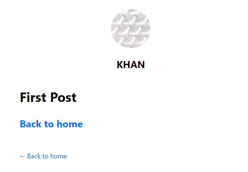
component/layout.js 를 아래와 같이 바꾼다.
const name = 'Your Name' 부분은 본인이 원하는 이름으로 수정한다.
import Head from 'next/head'
import Image from 'next/image'
import styles from './layout.module.css'
import utilStyles from '../styles/utils.module.css'
import Link from 'next/link'

const name = 'Your Name'
export const siteTitle = 'Next.js Sample Website'

export default function Layout({ children, home }) {
  return (
    <div className={styles.container}>
      <Head>
        <link rel="icon" href="/favicon.ico" />
        <meta
          name="description"
          content="Learn how to build a personal website using Next.js"
        />
        <meta
          property="og:image"
          content={`https://og-image.vercel.app/${encodeURI(
            siteTitle
          )}.png?theme=light&md=0&fontSize=75px&images=https%3A%2F%2Fassets.vercel.com%2Fimage%2Fupload%2Ffront%2Fassets%2Fdesign%2Fnextjs-black-logo.svg`}
        />
        <meta name="og:title" content={siteTitle} />
        <meta name="twitter:card" content="summary_large_image" />
      </Head>
      <header className={styles.header}>
        {home ? (
          <>
            <Image
              priority
              src="/images/profile.jpg"
              className={utilStyles.borderCircle}
              height={144}
              width={144}
              alt={name}
            />
            <h1 className={utilStyles.heading2Xl}>{name}</h1>
          </>
        ) : (
          <>
            <Link href="/">
              <a>
                <Image
                  priority
                  src="/images/profile.jpg"
                  className={utilStyles.borderCircle}
                  height={108}
                  width={108}
                  alt={name}
                />
              </a>
            </Link>
            <h2 className={utilStyles.headingLg}>
              <Link href="/">
                <a className={utilStyles.colorInherit}>{name}</a>
              </Link>
            </h2>
          </>
        )}
      </header>
      <main>{children}</main>
      {!home && (
        <div className={styles.backToHome}>
          <Link href="/">
            <a>← Back to home</a>
          </Link>
        </div>
      )}
    </div>
  )
}
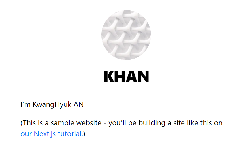
pages/index.js 를 아래와 같이 바꾼다.
[Your Self Introduction] 부분을 원하는 글로 바꾼다.
import Head from 'next/head'
import Layout, { siteTitle } from '../components/layout'
import utilStyles from '../styles/utils.module.css'

export default function Home() {
  return (
    <Layout home>
      <Head>
        <title>{siteTitle}</title>
      </Head>
      <section className={utilStyles.headingMd}>
        <p>[Your Self Introduction]</p>
        <p>
          (This is a sample website - you’ll be building a site like this on{' '}
          <a href="https://nextjs.org/learn">our Next.js tutorial</a>.)
        </p>
      </section>
    </Layout>
  )
}
그럼 아래와 같이 출력되는 것을 볼 수 있다.
Styling Tips
classnames 라이브러리 사용시 아래와 같이 사용할 수 있다.
import styles from './alert.module.css'
import cn from 'classnames'

export default function Alert({ children, type }) {
  return (
    <div
      className={cn({
        [styles.success]: type === 'success',
        [styles.error]: type === 'error'
      })}
    >
      {children}
    </div>
  )
}
PostCSS 또는 Sass 도 필요한 npm module을 설치하여 사용할 수 있다.
'개발 > Next.js' 카테고리의 다른 글
| [Next.js] 2. Navigate Between Pages (0) | 2021.08.04 |
|---|---|
| [Next.js] 1. 프로젝트 생성 및 시작하기 (0) | 2021.08.03 |