2017. 8. 30. 23:06ㆍ개발/React-Native
Modal 이란?
특정 이벤트에서 새창을 띄웠을때 원래 하던 작업을 계속 이어갈 수 있게 해놓은 것이 모달리스이며,
특정 이벤트에서 확인하거나 특정 이벤트를 날려주지 않으면 원래 하던 작업을 계속 이어갈수없는 새창을 모달이라고 한다.
모달리스의 예가 팝업창이다. 특정 쇼핑몰에 들어갔을때 프로모션 팝업창이 뜨더라도 무시하고 쇼핑몰을 계속 이용할수있다.
모달의 예는 경고창이다. 경고에대해 확인 버튼을 눌러주기 전까지 아무런 동작을 하지 못한다.
Modal 예시
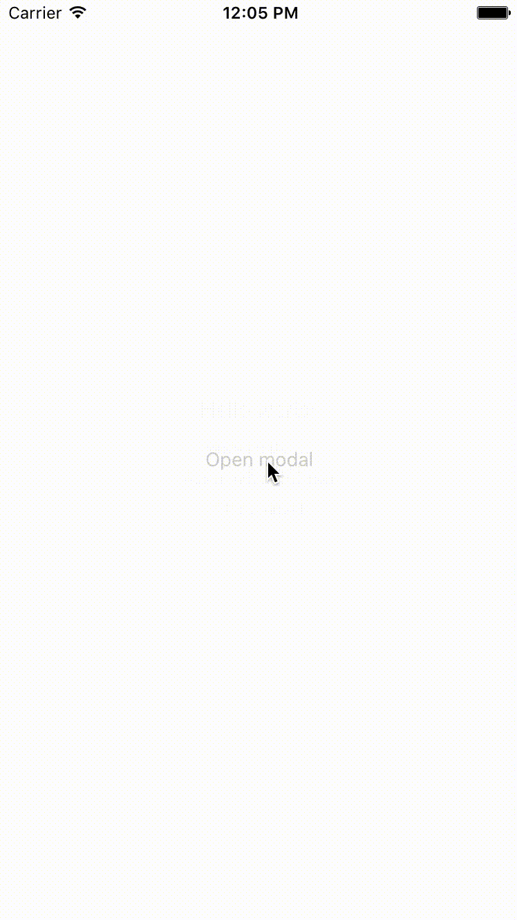
위 화면은 React-Native에서 구현할 수 있는 모달창이다. close modal을 하기전까지 원래 페이지에 있는 버튼을 누르지 못한다.
출처: https://www.npmjs.com/package/react-native-simple-modal
모듈 설치
npm install react-native-simple-modal --save
--> iOS, Android 모두 지원
사용법
다운받은 모듈을 import해준다.
1 | import Modal from 'react-native-simple-modal'; | cs |
state값에 Modal을 열고 닫을 수 있는 state를 추가한다.
1 | state = {open: false}; | cs |
모달을 열수 있는 버튼을 하나 만든다. (react-native-simple-modal에서는 TouchableOpacity로 예제를 구성해두었다.)
1 2 3 | <TouchableOpacity onPress={() => this.setState({open: true})}> <Text>Open modal</Text> </TouchableOpacity> | cs |
모달창을 생성한다.
1 2 3 4 5 6 7 8 9 10 | <Modal offset={this.state.offset} open={this.state.open} modalDidOpen={() => console.log('modal did open')} modalDidClose={() => this.setState({open: false})} style={{alignItems: 'center'}}> <View> : </View> </Modal> | cs |
1 : Modal 태그를 생서한다.
2 : offset 은 모달의 위치를 뜻한다.
3 : open 은 모달이 띄워져있거나 감춰져있는 상태를 뜻한다.
4~5 : modalDidOpen, modalDidclose 은 모달이 열릴/닫힐때 실행된다.
6 : style 은 말그대로 모달의 스타일 부분이다.
옵션값으로 다양한 것들을 사용할 수 있으며, default로 설정되어있는 모달창은 다음과 같다.
1 2 3 4 5 6 7 8 9 10 11 12 13 14 15 16 17 18 19 20 | <Modal open={false} offset={0} overlayBackground={'rgba(0, 0, 0, 0.75)'} animationDuration={200} animationTension={40} modalDidOpen={() => undefined} modalDidClose={() => undefined} closeOnTouchOutside={true} containerStyle={{ justifyContent: 'center' }} modalStyle={{ borderRadius: 2, margin: 20, padding: 10, backgroundColor: '#F5F5F5' }} disableOnBackPress={false}> </Modal> | cs |
자주 썼었던 부분만 보면
overlayBackground는 모달창을 띄우게 되면 현재창은 불투명한 색상으로바뀌게 되는데 이때 불투명한 색상을 지정하는 부분이다.
--> rgba(0,0,0,0.75) 의 뜻은 75%의 투명도를 갖는것을 의미한다.
closeOnTouchOutside는 모달창내에 버튼을 생성해서 해당 버튼을 클릭하게 되었을 경우 모달창을 종료하는 방법도 있지만 뒷배경을 클릭했을때 모달창을 종료하는 방법도 있다. 이 옵션값을 설정하면 후자의 방법으로도 모달창을 종료할 수 있으며, default값은 true이다.
전체 예제 코드
1 2 3 4 5 6 7 8 9 10 11 12 13 14 15 16 17 18 19 20 21 22 23 24 25 26 27 28 29 30 31 32 33 34 35 36 37 38 39 40 41 42 43 | import React from 'react'; import Modal from 'react-native-simple-modal'; import {AppRegistry, Text, TouchableOpacity, View} from 'react-native'; export default class Example extends React.Component { state = {open: false}; render() { return ( <View style={{flex: 1, justifyContent: 'center', alignItems: 'center'}}> <TouchableOpacity onPress={() => this.setState({open: true})}> <Text>Open modal</Text> </TouchableOpacity> <Modal offset={this.state.offset} open={this.state.open} modalDidOpen={() => console.log('modal did open')} modalDidClose={() => this.setState({open: false})} style={{alignItems: 'center'}}> <View> <Text style={{fontSize: 20, marginBottom: 10}}>Hello world!</Text> <TouchableOpacity style={{margin: 5}} onPress={() => this.setState({offset: -100})}> <Text>Move modal up</Text> </TouchableOpacity> <TouchableOpacity style={{margin: 5}} onPress={() => this.setState({offset: 0})}> <Text>Reset modal position</Text> </TouchableOpacity> <TouchableOpacity style={{margin: 5}} onPress={() => this.setState({open: false})}> <Text>Close modal</Text> </TouchableOpacity> </View> </Modal> </View> ); } } AppRegistry.registerComponent('ExampleModal', () => Example); | cs |
출처
'개발 > React-Native' 카테고리의 다른 글
| [React-Native] 하이브리드 앱에 jar 파일 추가하는 방법 (0) | 2017.09.12 |
|---|---|
| [React-Native] Android Emulator 사용시 추천 방법 (0) | 2017.08.26 |
| [React-Native] remove listener (0) | 2017.05.25 |
| [React-Native] Android Release APK 생성 (2) | 2017.05.18 |